David’s Bridal—Something New
In 2019, David's Bridal set a bold new vision for its internal product knowledge training strategy and needed to provide teams across the world with easy access to up-to-date new product launches and the clarity to sell with confidence. So, I created a single source of truth for all things related to gown, dress, and accessory education—a digital product called "Something New."
As Product Lead on the initiative, I partner cross-functionally to harness strategy and provide creative solutions that support new merchandise awareness, corporate partnerships, and brand activations. I am responsible for conceptualization, visual design, UX design, UX writing, interaction design, a custom design system (branding continuity, layouts, typography, icons, & the sourcing of photography), strategic alignment, and usability testing. The project was designed to speed up product knowledge training across the organization and unite 10k+ employees and corporate partners.
My goal with Something New was to make the product all about the end user—the training had to be:
easy to use
intuitive to understand
fast to update
drive conversion
Results: Something New has equipped the sales staff with all the evergreen and seasonal product knowledge and supported the boost in overall Total Merchandise Sales % compared to FY 2019, with growth in the majority of the merchandise sales categories. Something New also earned the highest engagement rate in the learning app for 2021—averaging 80% and an audience of 10K+. Since I launched the product in 2019, consumer engagement has improved by 5%.
My role: UX Research, UI, UX & Visual Design, UX Testing, and Brand Strategy
Timeline: Three and a half months
Client: David’s Bridal—Learning & Development Team
Company: David’s Bridal
David’s Bridal, 2021-2022
Login, Dashboard, and Project Reader view.
Compiling the Library
While creating the design system and defining the modular components, we collected them in a master asset file called the “Design Pattern Library,” which we referred to throughout the design process. While the library was growing, I started organizing individual components into templates containing similar items or layout options (organized bye general category such as: Process, Speciality, Selling Processes, Alterations). After three weeks we began to see huge leaps in productivity by using the template options and design pattern library when iterating on designs. In February 2022, while putting together a last-minute prototype, I team was able to create nearly 25 screens within in two hours by using the framework our library provided.
Design Goals
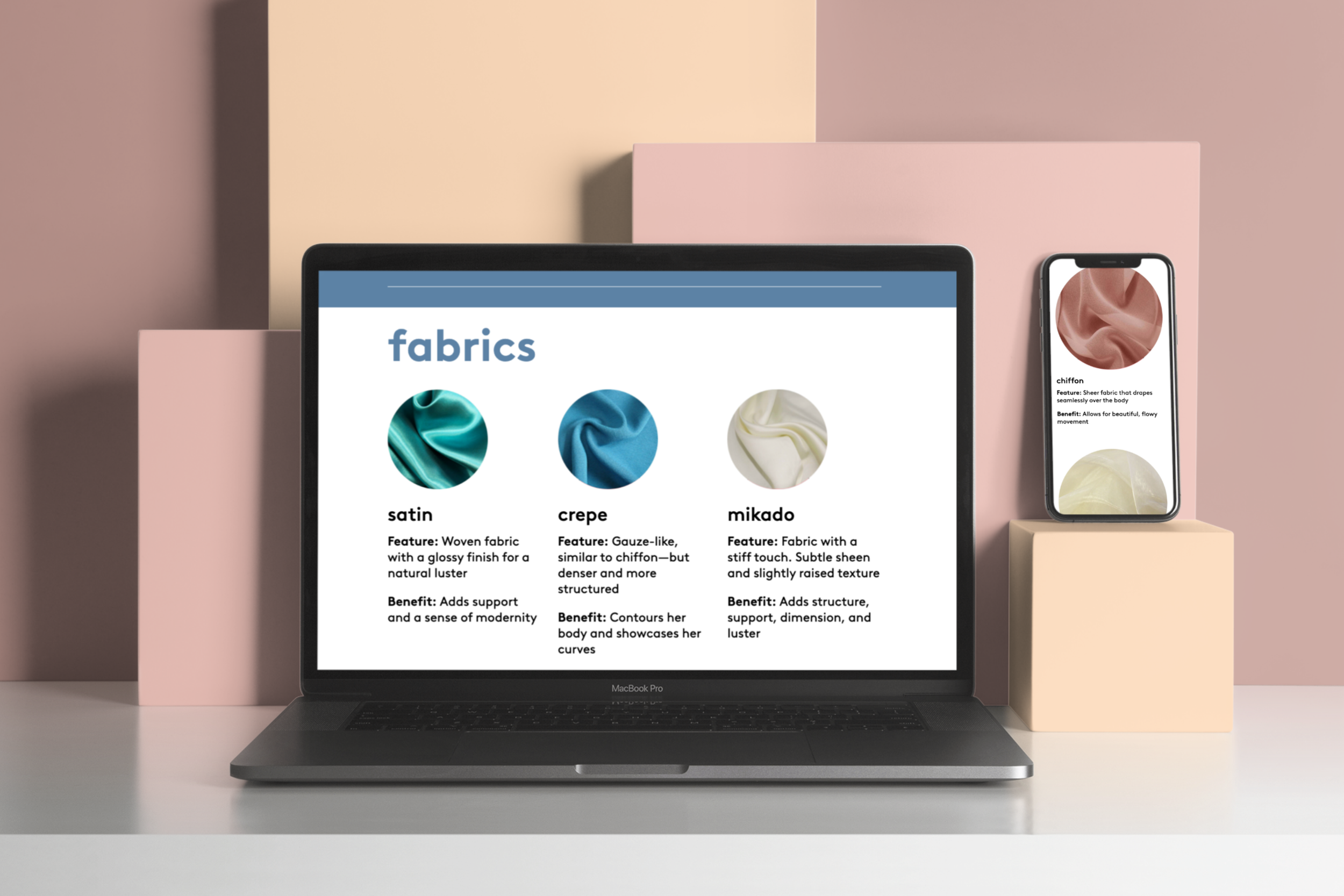
Retain “bite-sized/snackable” learning with simple, packaged layouts
Honor photography with a few photo-centric layouts
Design Critique
Design for multiple states of content.
Do the mockups prioritize the user-centered design experience?
Are the designs functional and is the content easy to view?
Do the mockups embody the David’s brand identity?
What is working well and what should we keep?
What is not working and could be eliminated?
Process—Preliminary Ideation
We used a Lean UX and a user-centered design process of mapping to identify not only the general scope of Something New, but to help decide which direction we wanted to take the product. This was a form of brainstorming during our kickoff period that proved to be very helpful in setting up the foundation for the rest of our process. Understanding the customer needs is what created the opportunity for product innovation!
“Something New is amazing!! Can’t wait to see the product in store! I can see the difference in our marketing! There is clearly a genuine love and passion for the product that was not there before. ”
Ensure scalability of Something New design for use across multiple devices.
In my UX research, I discovered one 90% of end users access Something New via their iPad. So I have prioritized prototyping and designing responsive content in the iPad display first.
Interaction of head-to-toe styling for a quinceañera look.
Example of interactive knowledge checks.
Example of a user leaving feedback with a few simple clicks.
Rearchitect the product knowledge pages and product details pages to introduce an intuitive way to show the merchant strategies and top brands.
Conclusion
While this was a large task that ended up requiring efforts from myself and, cross-functionally, many of David’s Bridal Marketing Team leads and Merchandising Lead Buyers, we found it was worth the investment and a giant leap forward. We can now build and release features on all native platforms at roughly the same time. This system also enables the Learning and Development team to prototype and experiment with ideas in high fidelity more quickly and at a lower cost.
I believe that aided with these systems we can focus more on actual user experiences, the next generation of users, and the product knowledge concepts we want to create in the future. By being sensitive to the user experience, we can ensure we produce a premiere product that deliver results for the business and delight to the end users.


